Scroll Down
Scroll Down
Scroll Down
DOPEMATIC
The state of being automatically dope.
From optimal digital strategies to conveying top solutions via digital designs, Dopematic creations aim at exemplifying & delivering the best. In creating an emotional relationship between Dopematic’s business & their clients, I Dopematic’s mission, values, vision and their voice via a new Brand Identity.

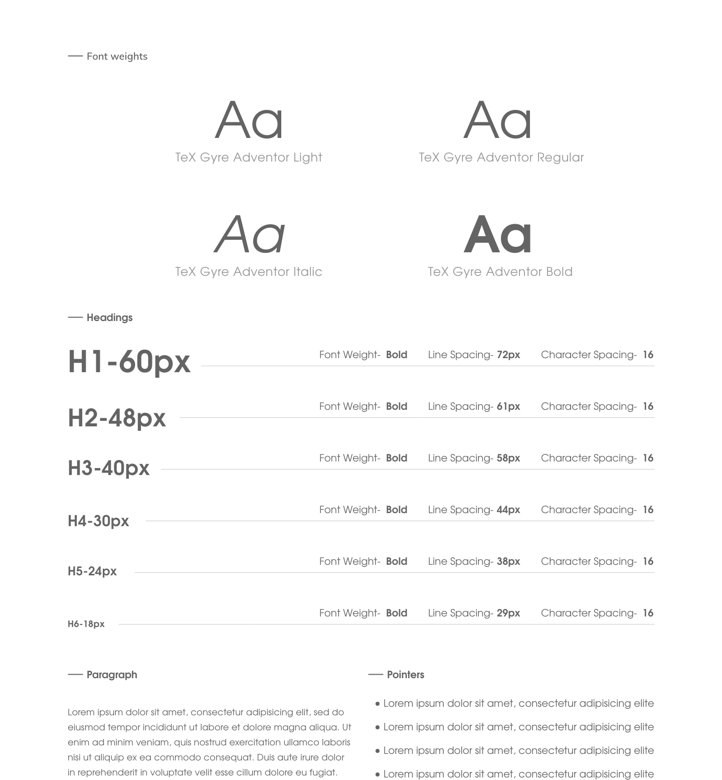
The Style
Modern, Cool. Creative. Bold.
Dopematic projects an image of a modern, edgy, cool brand. And its style follows accordingly.

The Logo
Recognizable. Memorarable.
The key was to establish a professional visual presence to give coherence to all our other platforms when it comes to visual look. I began making connections between the business' services, goals, and the symbolizm I wanted to portray from a logo and type of character we wanted to envoke.
-
The "fire" symbol was perfect for this. It causes an immediate connection with being hot or lit, which in modern, slang terms means: cool, great, and of top-quality.
Thus the "fire" graphic + letter "d" of Dopematic = morphed combo of the resulting logo.
The fire graphic symbol, doubling as a "d", becomes the Dopematic Logo.
Color Psychology
Influence of Color in Perception
Something as simple as changing the exact hue or saturation of a color can evoke a completely different feeling. Thus giving each color a different meaning from the rest.


The Colors
To embody the Dopematic feel & message via colors, I decided on a combination of the following Key Colors:
-
Black - Bold, Rich, Elegance, Strength
Blues - Trust, Power, Smart
Pink - Caring, Sensitive
Purple - Royal, Luxury, Creative


Logo Styles
Applying all of the aboce and combining them with Dopematic's newly branded elements to form one cohesive identity.